


2D PORTFOLIO
- HOLLY NOWAK

- Feb 1, 2019
- 4 min read
As I am aiming to go on and work independently I need to consider what kind of 2D portfolio I would like to develop.
- branding : company name, logo
- website : blog/website
- stop motion film
- promotional material : business cards, packaging, postcards
- concept book : folklore tale
HOLLY NOWAK @ THE HUNGRY GHOST

WHY THE EYE?
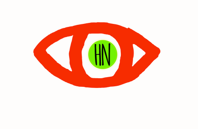
I had always imagined my own branding to have a logo and not just lettering.
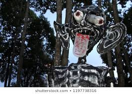
Whilst researching the Hungry Ghost Festival in Thailand, I found a lot of the costumes and masks made were focused heavily around monster eyes. Ghosts can be seen as being scary and terrifying in many cultures so using a monster eye to represent the ghosts is common practise across Southeast Asia.


I had started using the eye logo throughout my studio space and my sketch book as a way to demonstrate a colour palette and characterisation of the ghost, I really liked how it sat within the project.


When starting to design 'eye' logos I had already some ideas, as a designer I work mainly by hand, in sketchbooks, with photographs, when developing or adding decorative details. The knitting processes and techniques I have been learning are also achieved by hand so I knew I didn't want anything 'well polished' so to speak, or overly defined, I wanted something that gave off the impression of being made by hand.
I started drawing the outline of the eye and using different materials to do so, using pencils, outlines, paint etc.

I like the soft, illustrated lines of the outline of the eye but I'd like to create more of a contrast against the red pupil circle in the centre. So rather than using the painted image I added a perfect circle to the centre.
I tried using a black outline but I feel like it looses everything I initially liked about the free painted line. I like adding my initials to the centre, I prefer having that being the only black line in the design, its more eye catching and contrasting.

Working with these drawings and experiments on photoshop I developed three different options.
Some other shapes I developed but didn't take forward...


WHY RED AND GREEN?
When I first got my photos developed from my travels through Southeast Asia I spent a bit of time studying the colour combinations found in the photos. Red and green, amongst many others, featured heavily throughout a lot of my photos, many red lanterns and street decoration and such vibrant shades of green found within the nature.
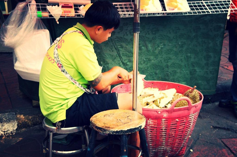
A lot of my photographs capturing the urban culture in Southeast Asia feature the faces found in those areas, and the activity and things they are doing. I love the colours from this photo below, something about the very bright neon lime green against the faded, more rustic red of the basket. It became the initial colour palette for my sampling at the very beginning when learning basic knit techniques and then continued to have more of a presence throughout the project.


Although my colour palette for the whole project is very varied, I felt like the combination of the red and lime green being so bold that is was 'fun' enough to work really well alongside this project, but also going forward.
The concept of using a monster eye also provides some idea what The Hungry Ghost brand would be like going forward. The idea for this project gave me a lot of elements to consider, being eaten by the ghost, feeling consumed, textiles being eaten or worn away. This could translate to so many different projects that I feel like having the eye as not only a project but brand logo is a strong idea going forward, it not only suits this project very well but also myself as a designer.
THE EYE WILL BE FEATURED THROUGHOUT THE KNITTED TEXTILES:


As the eye is becoming very present throughout my development 2D sketchbook work, within my studio space and on my online blog, I have started to develop designs for my outcomes where the eye will pop up within each outcome.
I am currently developing knitting the eye and then considering the placement of it throughout the outcomes;
- randomly placed around the cacti chair to show lots of hungry ghosts hidden away
- placed up the 'stem' of the lamp to show the ghosts moving towards the town
- repeated around the trim of the lantern, acting as a border, then hanging randomly on the tassels
- placed on only the mini lanterns to show the ghosts returning to the netherworld
The eye is also a key element in my ideas for a short film, I am still working on the concept but the eye coming to life, or growing a mouth and teeth, to then eat all the knitted furnishings is along the lines of what I'd like to explore.
Trying out different colour combinations from my colour palette...


BLOG/WEBSITE STYLE :
The project is very bright and eye catching, from the use of colour to the exciting decorative details and sensory sculptural details. The layout for a blog or website needs to be simple and clean. Anything else could be considered too busy. I originally made a blog that ran along side my sketchbook but I felt like it was too much. Too busy and distracting from the project itself.
I refreshed my blog and updated it with a cleaner over all aesthetic and refined typeface etc.
Having two different fonts works really well, it makes the more illustrative font of The Hungry Ghost stand out and having my name and short description of the work in a cleaner font feels direct and more professional - Avenir Next and Amatic SC.

Having decided on the eye logo for The Hungry Ghost, and establishing an online cohesive presence via the website style blog and instagram, I have been considering what the design of promotional materials could be.
Business cards:
- I'd love the cards to be glow in the dark ; consider cost and printers?
- Would the eye be small on the page?
- Would I keep my initials in the middle or would I consider using the two fonts.
Product fabric labelling/packaging:
- Eye stitched in
- Black label with glow in the dark uv yarn
- Repeat print of eye on tissue paper
- Tape for box packaging with the repeat of the eye


Comments